Brand Evolution
LIVE HERE LOVE HERE
Place, participation and purpose unified through one evolving identity
A more flexible identity system designed to connect campaigns, education and community action under one recognisable public brand.
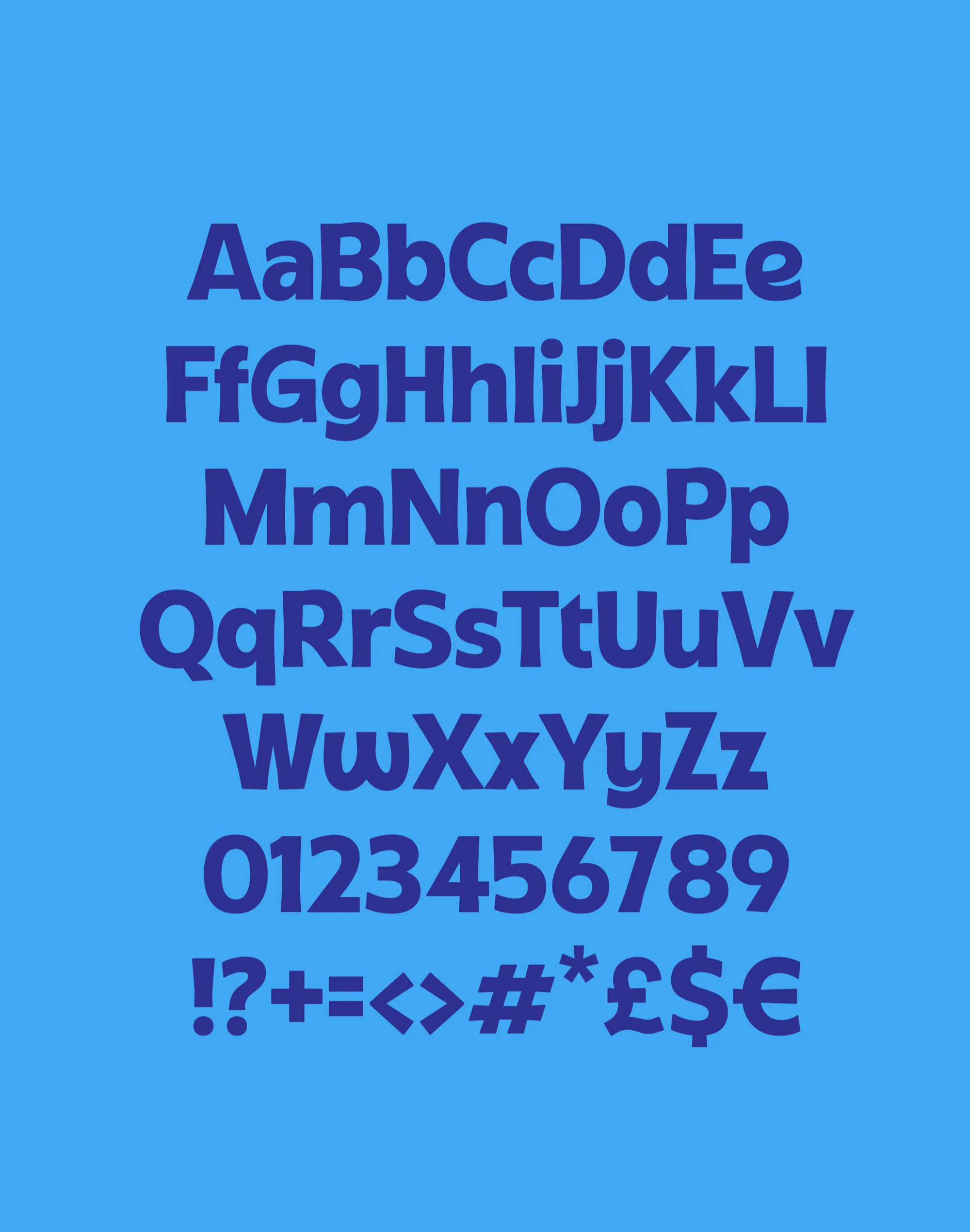
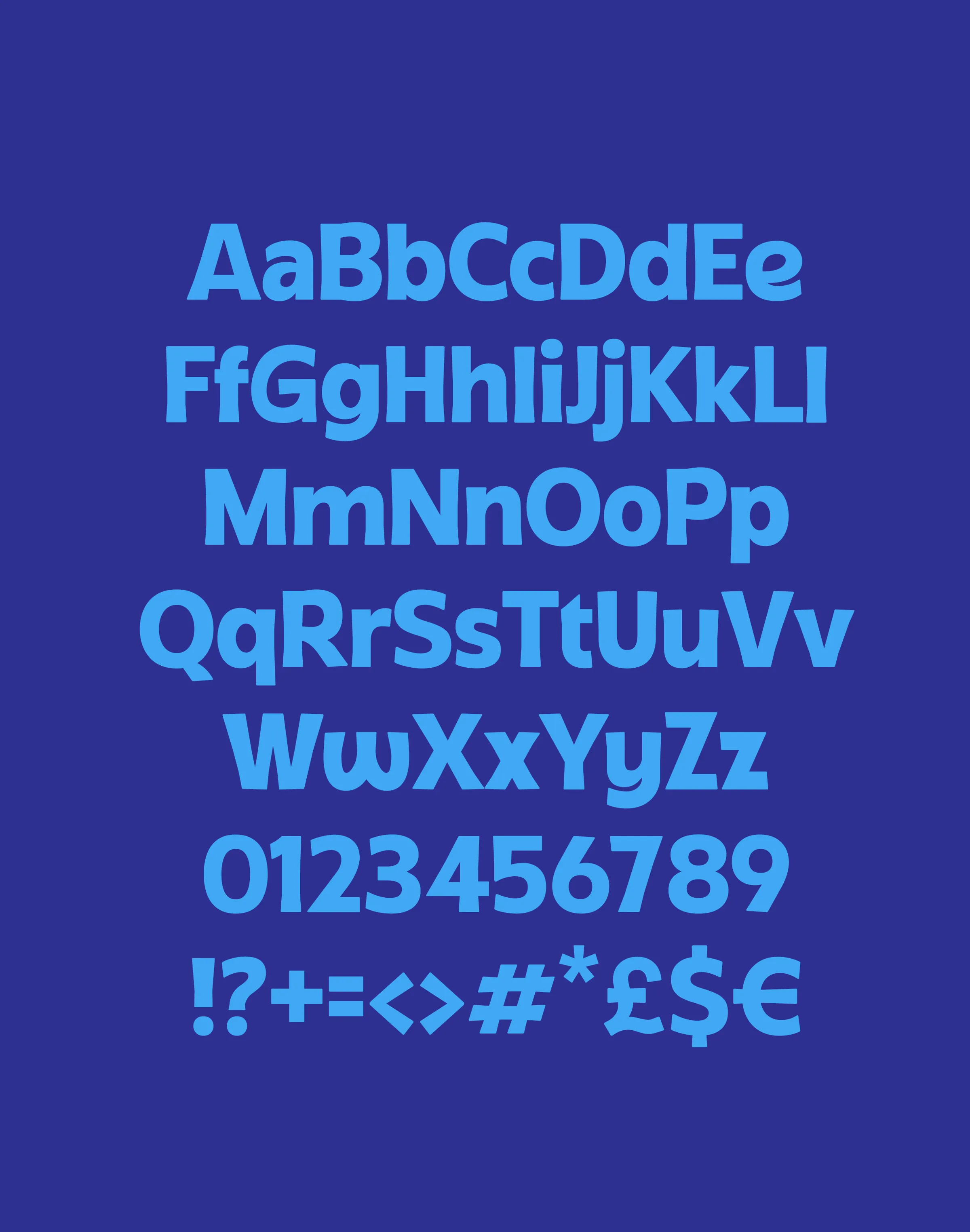
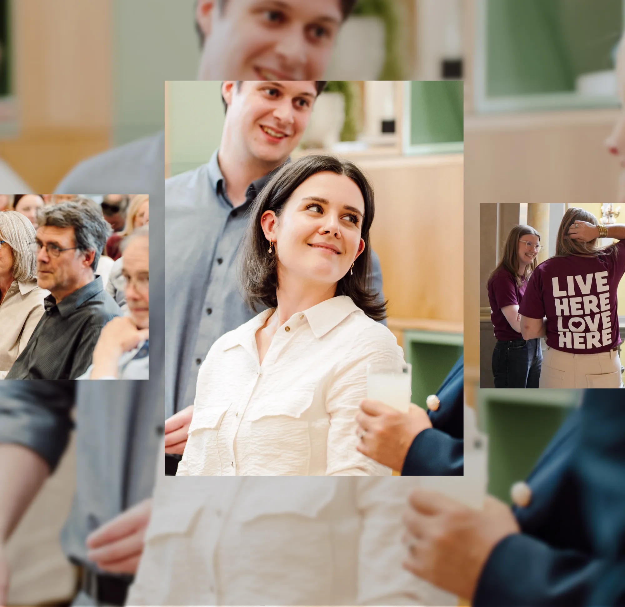
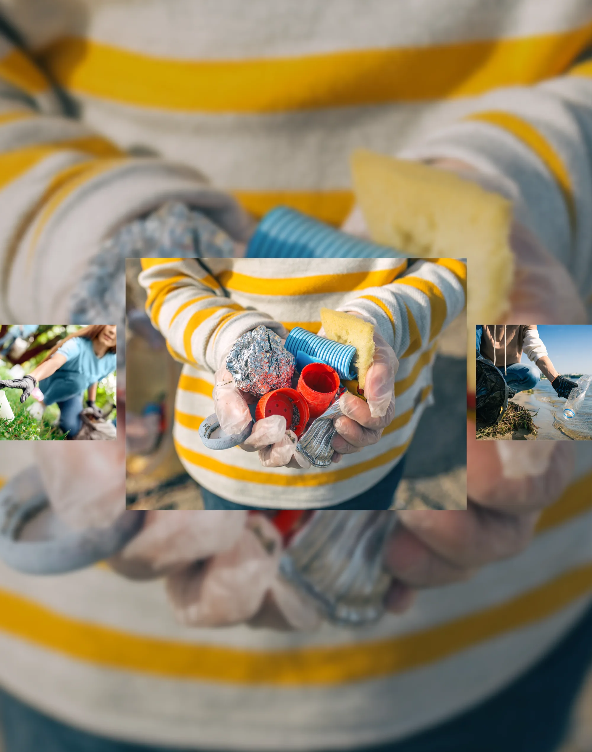
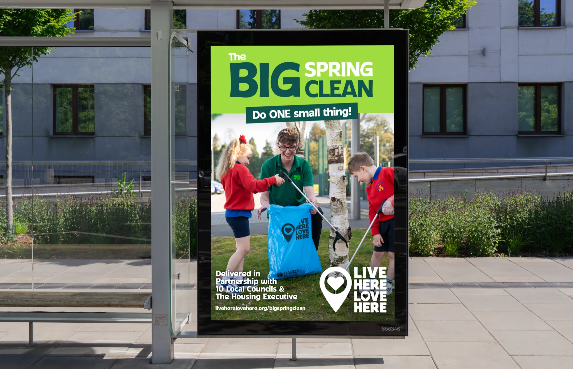
Evolving a recognised logo into a more vibrant and scalable identity system. The refreshed mark retains the familiarity and warmth of the original while introducing greater balance and energy across multiple applications.
Brand Architecture
Bringing multiple programmes together under one connected system
Identity System
Building a visual language that feels human, adaptable and recognisable
We knew something needed to change, but not necessarily what the answer was. They helped us work through that properly and arrived at something that feels exciting, relevant and still very much ours.
Claire IrwinHead of Communications, Live Here Love Here
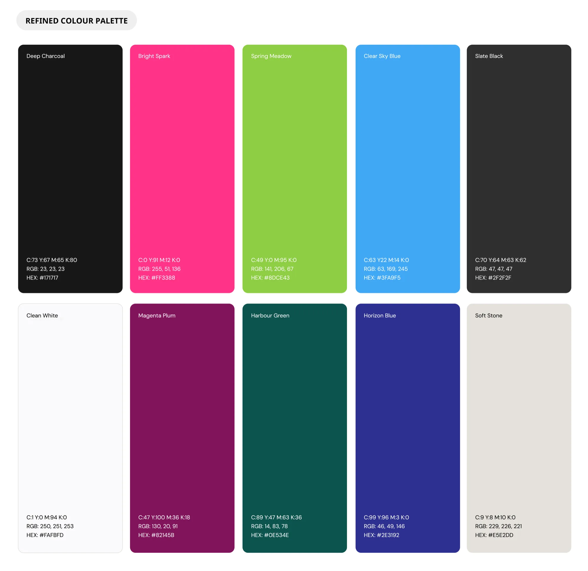
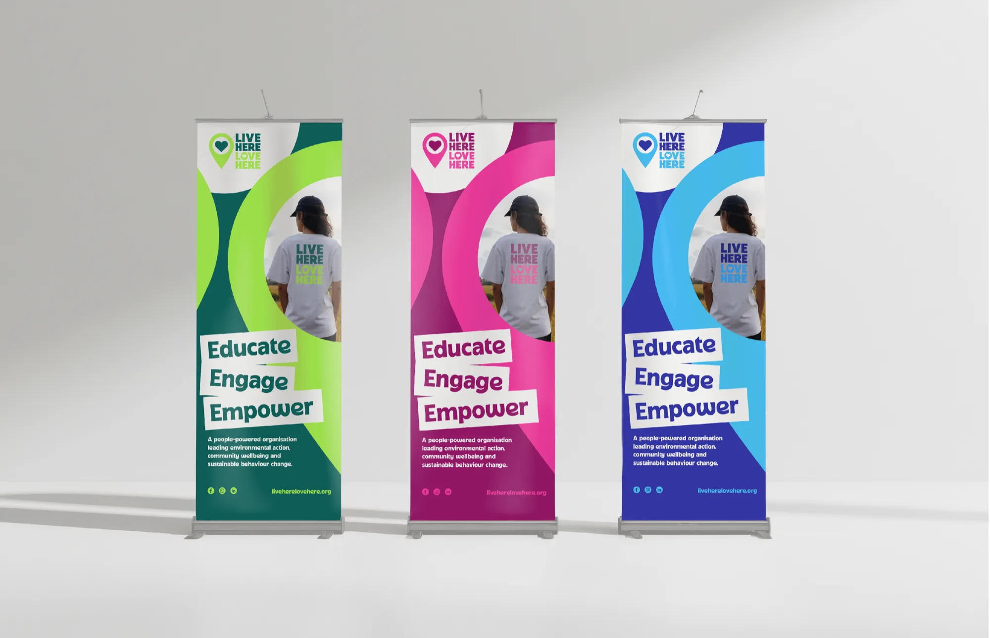
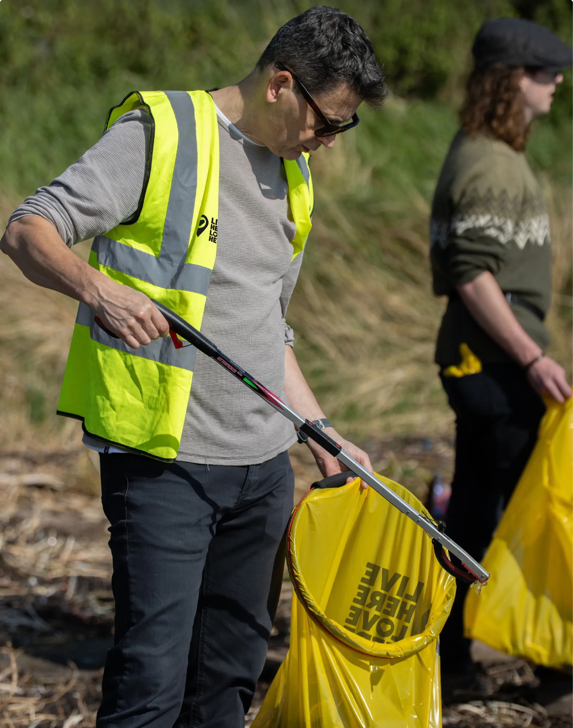
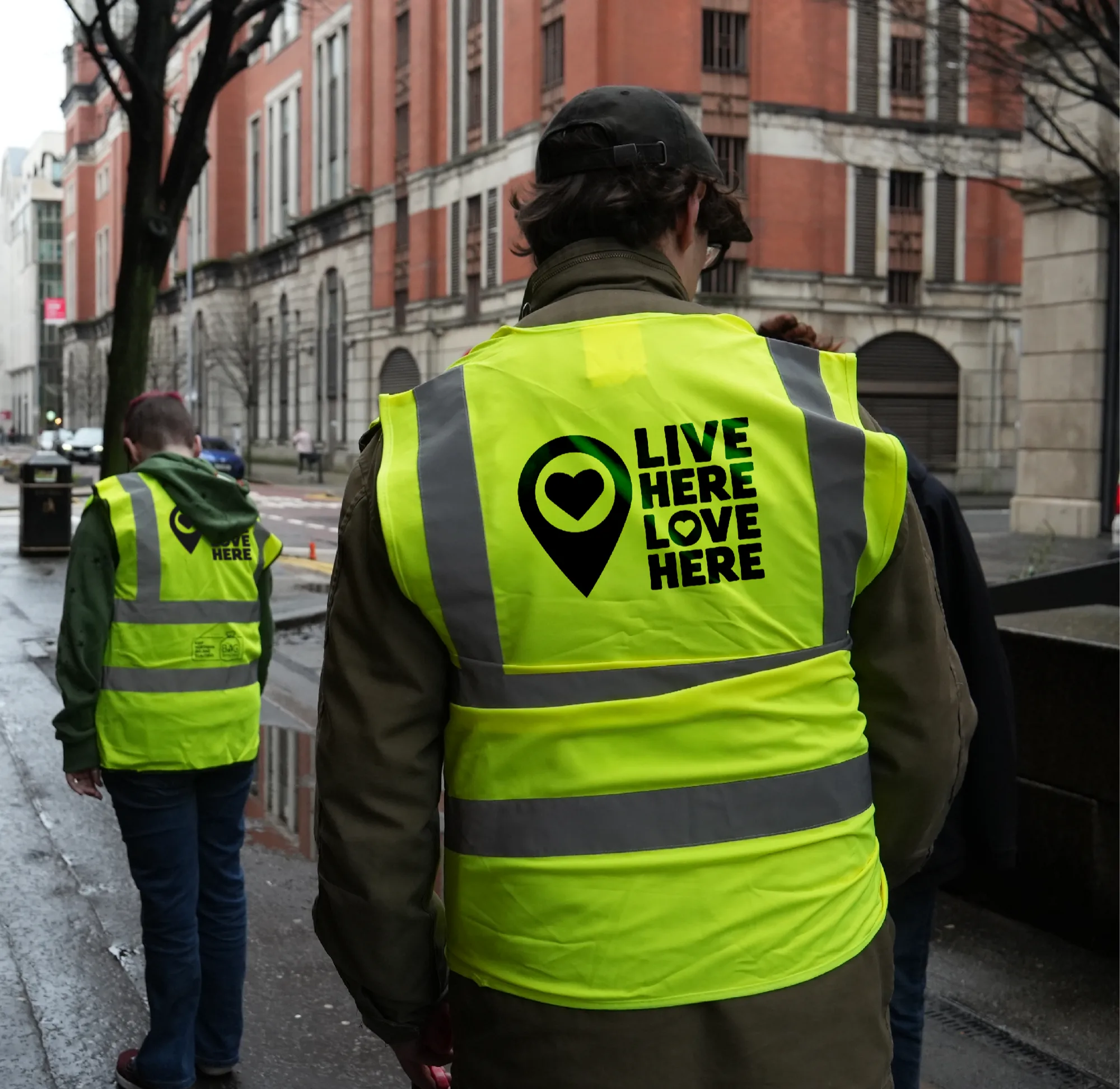
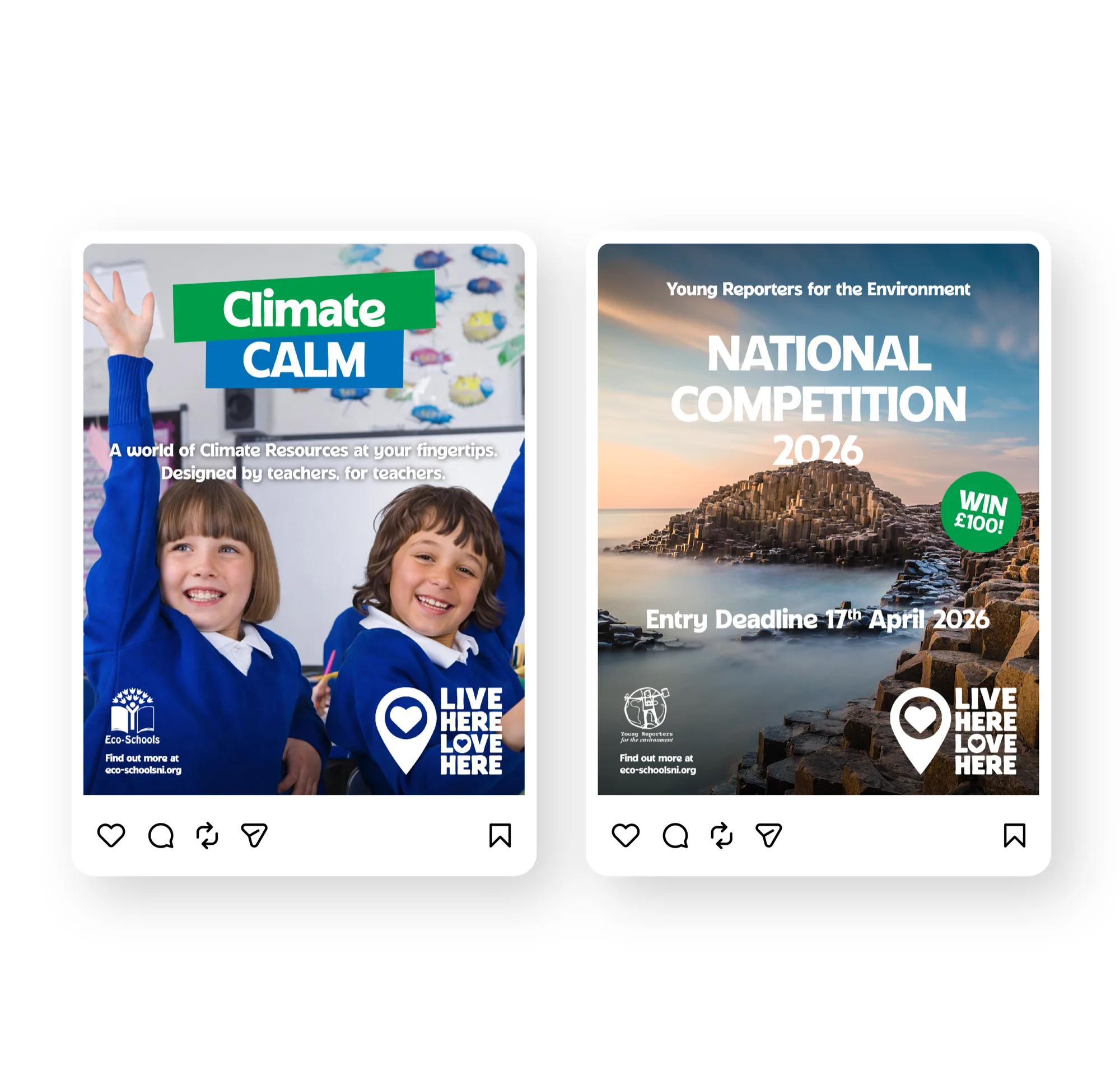
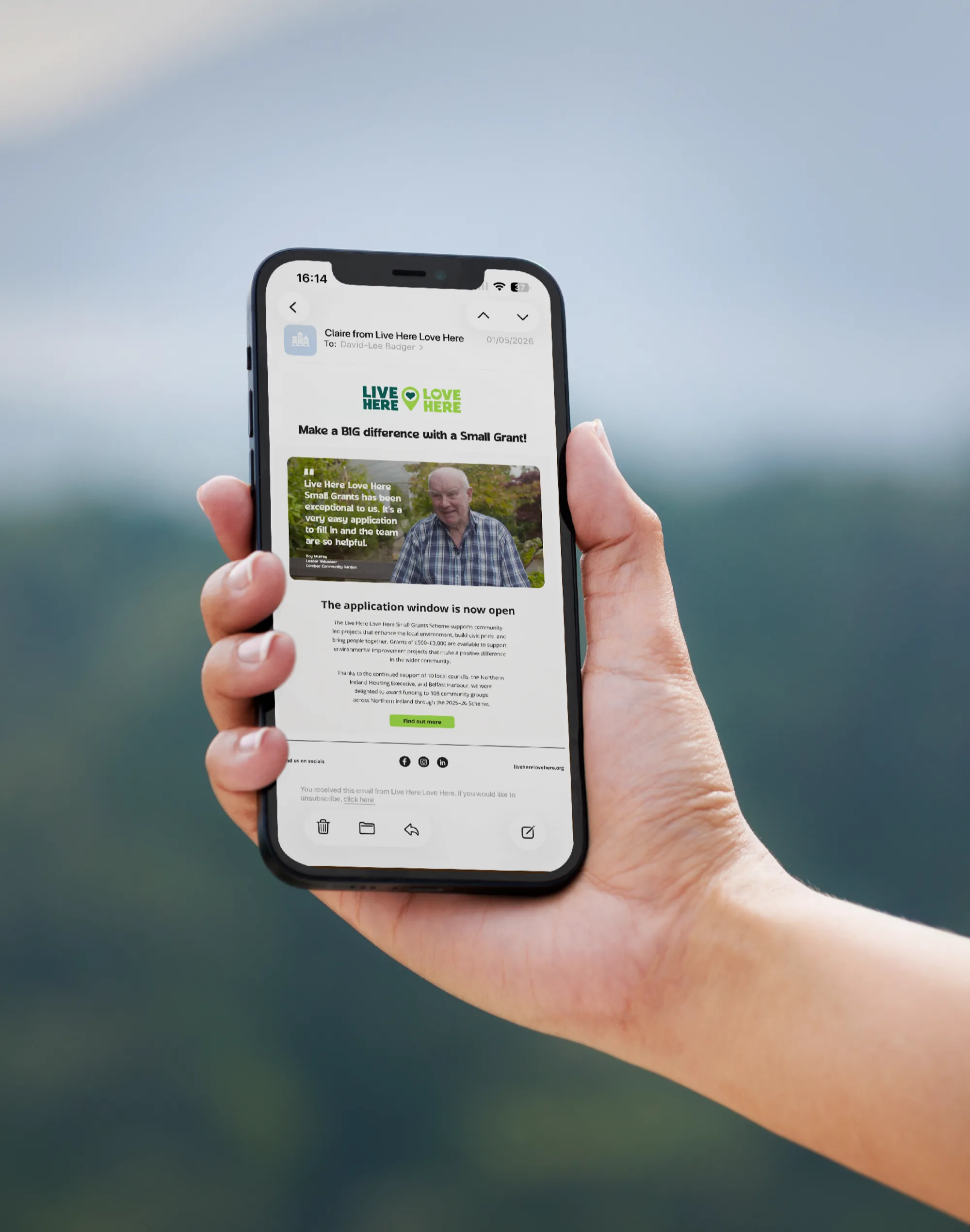
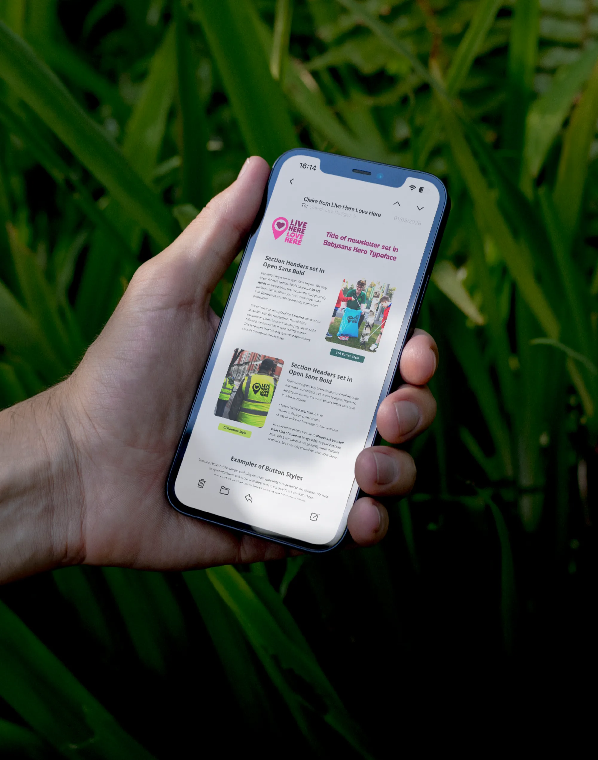
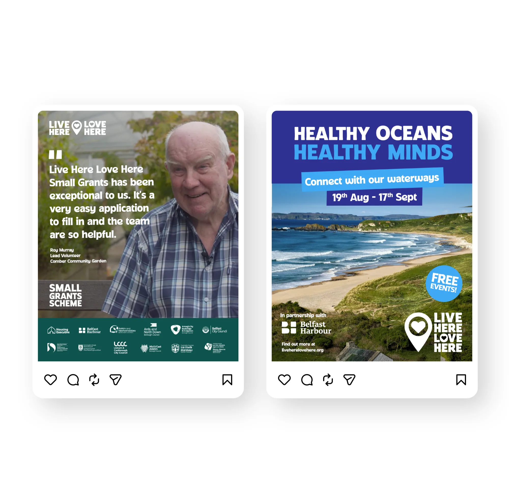
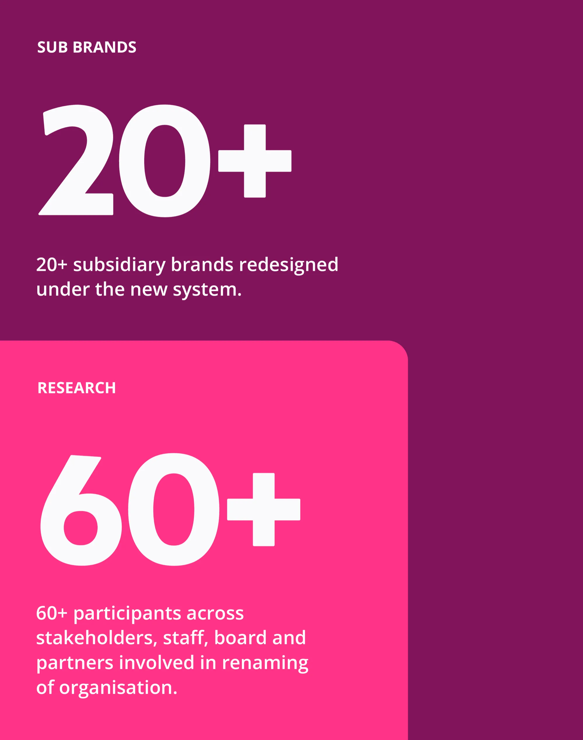
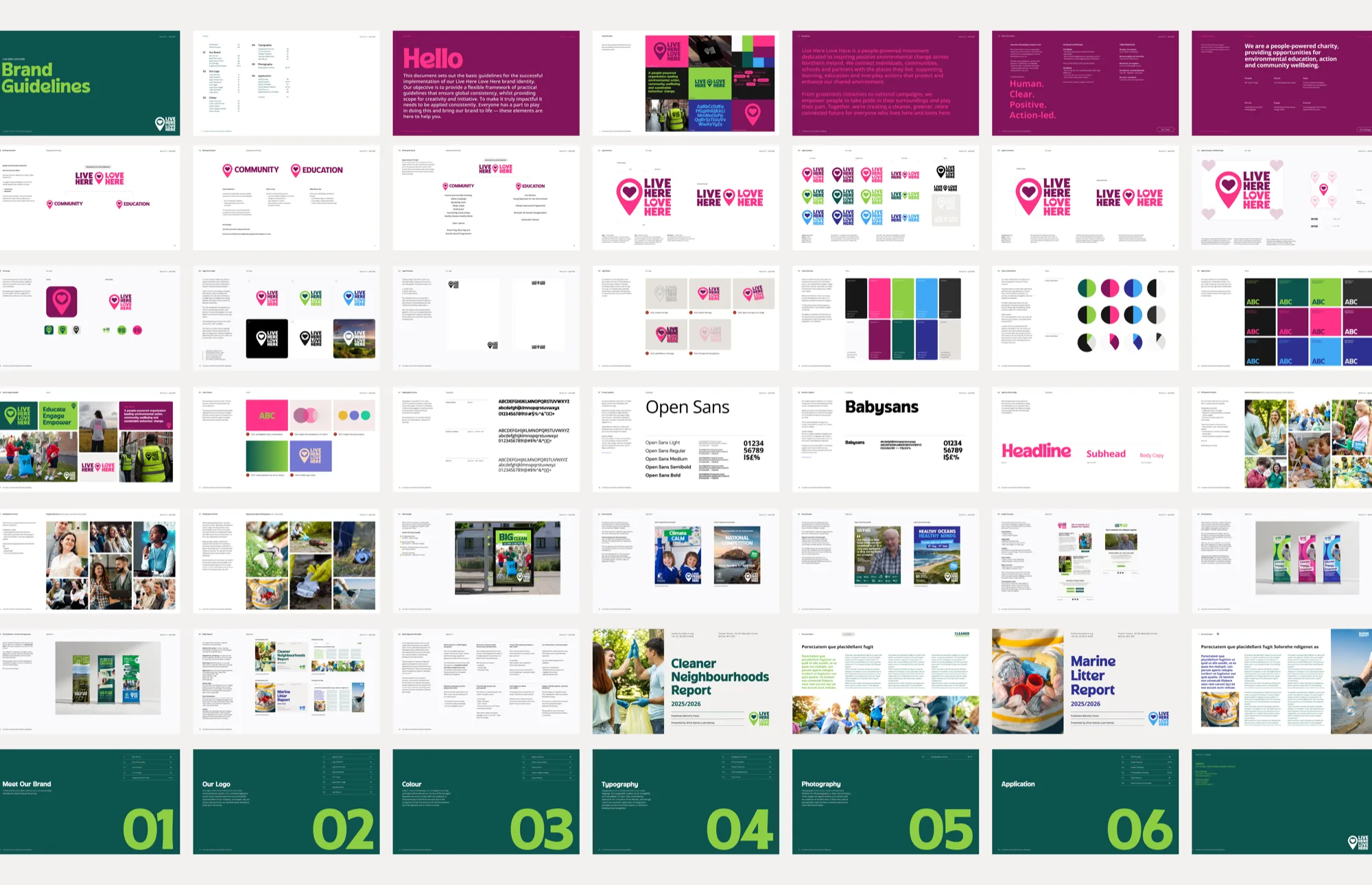
LIVE HERE LOVE HERE had become far more than a campaign. Over the past decade, the organisation behind it had expanded into education, behaviour change, civic partnerships and environmental leadership, yet public perception and brand structure hadn't evolved at the same pace. Recognition sat across disconnected programmes, while Keep Northern Ireland Beautiful increasingly felt tied to a narrower, more traditional understanding of environmental action. Before any design work began, the process focused on understanding perception, structure and ambition from within the organisation itself. Through stakeholder engagement sessions, internal surveys and sentiment analysis, recurring themes quickly emerged. Individual programmes such as LIVE HERE LOVE HERE and Eco-Schools carried strong public recognition, while the wider organisational structure often felt fragmented and difficult to navigate. This opened a broader strategic conversation around naming, brand architecture and public positioning. Multiple directions were explored, from entirely new names to evolutionary approaches retaining existing equity. A clear consensus emerged around LIVE HERE LOVE HERE as the strongest foundation for a future-facing masterbrand. Our response repositioned LIVE HERE LOVE HERE as the organisation's primary public identity. The identity itself was rebuilt around clarity, flexibility and energy. The logo evolved from a dense and ageing mark into a more balanced, vibrant and scalable system while retaining enough familiarity to carry existing recognition forward. Around this, we developed a more cohesive visual language with a refined palette, simplified hierarchy and adaptable graphic system capable of flexing across campaigns, partnerships, education programmes and public engagement. Equally important was the restructuring of the wider brand ecosystem. Community initiatives, education programmes and licensed schemes were brought into a clearer and more connected architecture, allowing the organisation to communicate more confidently as one joined-up movement rather than a collection of separate initiatives. The result is a brand that feels more open, progressive and people-powered. A system designed not just to promote environmental action, but to invite participation in it.
Strategy, Brand Architecture, Creative Direction, Visual Identity, Brand Systems, Campaign & Rollout DesignDavid-Lee BadgerBarry McCabeKaren Brady
MotionChris McKernan
Project ManagementHelen Tweedie